“The tentacles of the global warming hoax are everywhere,” said a foaming Sydney shock-jock Alan Jones on his high-ratings radio show.
“I don’t know why it’s not on the front page of the newspapers,” replied Jennifer Marohasy.
The subject of the pair’s wrath is the Bureau of Meteorology (BoM) — the Australian government’s weather bureau.
Specifically, it’s the way the bureau collects and records temperatures.
Marohasy works for the Institute of Public Affairs which, if you want to talk about tentacles, is firmly attached to the body of conservative “free market” groups around the world that deny the risks of human-caused climate change.
Last week, I interviewed former BoM director Rob Vertessy, who described the attacks from a “fever swamp” of climate science denial as being baseless, a waste of time, and dangerous, especially when they’re amplified by Rupert Murdoch’s newspaper The Australian.
“As the costs of climate change accumulate in the years ahead,” Vertessy said, “I can see that leaders of this climate change denial movement will really be seen as culpable.”
Institute of Public Affairs Tentacles
Marohasy has been pursuing the bureau with claims of “corruption” and “propaganda” since at least 2014.
Marohasy claims to have found genuine, substantive problems with the BoM data and that these problems undermine the credibility of the data that shows Australia has warmed about 1°C since the start of the 20th century.
So let me explain why it’s not on the front page of the newspapers, why there is no scandal, and how the bureau’s data has largely stood up to scrutiny.
First, Marohasy’s “criticisms” of the bureau’s data have been mostly fixed on a dataset known as ACORN–SAT — a temperature record that goes back to 1910 using data from 112 locations.
That data shows that Australia’s five hottest years on record have all happened since 2005 (starting with the hottest, the list goes 2013, 2005, 2014, 2016, 2009).
Homogenize This
There are two elements of the ACORN–SAT data that Marohasy has tried to argue against. Let’s take them in turn.
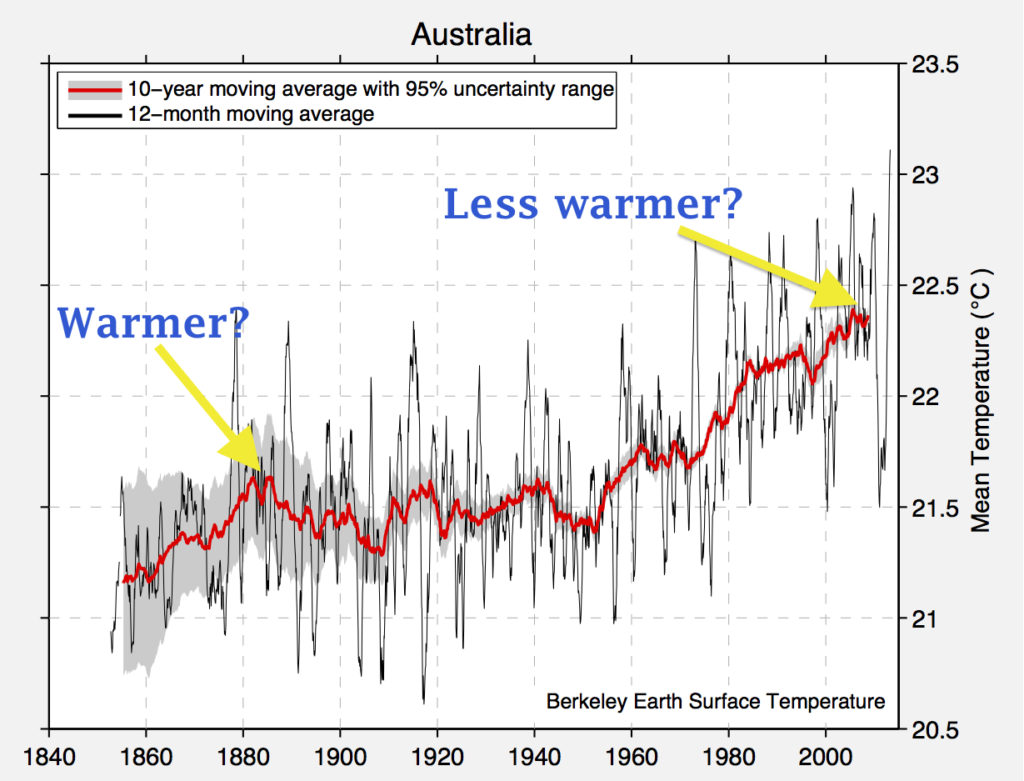
Marohasy says the bureau has data going back much further than 1910 (which it does) and that this would show that Australia was warmer back then than it is now, if only the bureau would include it.
This, by the way, is the exact same claim put by climate science denier and One Nation Senator Malcolm Roberts (who may not be a senator for much longer).
In a letter to Senator John Birmingham in March 2014, Marohasy wrote: “But inclusion of this data into the official Australian temperature record would likely show that the years of the Federation Drought (1896 to 1902) were as hot, or hotter than temperatures now.”
Would it really show that?
Well, the Berkeley Earth project used the same pre-1910 data that Marohasy refers to in a reconstruction of temperatures in Australia. The results could not be clearer. Marohasy is wrong. Australia is much warmer now than it was then.
A Berkeley Earth reconstruction of temperatures across Australia since the late 19th century.
Marohasy, like other global warming deniers, also attacks a method used by the BoM and other major climate and weather agencies around the world (and by the Berkeley project) that’s known as homogenization.
ACORN–SAT is a homogenized dataset. Homogenization takes account of changes in individual weather monitoring stations that can have an impact on the temperature recordings.
An example might be a temperature station being moved to a cooler spot, or buildings or vegetation changing around a site. If you were interested in changes relevant to the climate, then you would not want to introduce non-climatic errors into your data.
Professor Neville Nicholls of Monash University has explained why these adjustments matter and how ignoring clear problems with data isn’t how science is done.
Dr. Lisa Alexander, an associate professor at the University of New South Wales who deals with global datasets all the time, has told me: “Is the bureau fiddling the figures to fit with a global warming conspiracy? No! Are they amending the records to make them consistent through time? Yes.”
But in any case, what impact does this data homogenization have on Australia’s climate record. If you didn’t do it, would the story change?
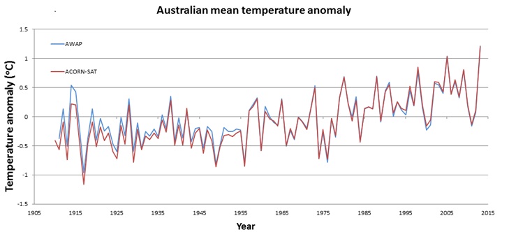
Well, the bureau runs another long-term dataset called AWAP and this uses unhomogenized temperature measurements from about 700 stations.
In a parliamentary hearing in 2014, Senator Matt Canavan asked then BoM director Rob Vertessy about this AWAP dataset and how its temperature results compared to ACORN–SAT.
Between 1911 and 2013, there was a 0.01°C difference in the average annual temperatures shown between the two. Here’s the comparison on a chart.
Two Australian climate datasets compared: AWAP and ACORN–SAT. Credit: Bureau of Meteorology
Considering that Australia has warmed by about 0.9°C since 1910, all of this means that whether you use homogenized or unhomogenized data, it really makes no difference.
Marohasy has also been claiming that because two of the bureau’s temperature stations had a fault that caused them to stop working at temperatures below -10.4°C, that this also undermined Australia’s clear warming trend (even though the temperature stations in question are not part of the ACORN–SAT dataset anyway).
There has been an inquiry into these claims, with three external experts joining two internal BoM staff. In short, the inquiry found the issue had no direct or indirect impact on Australia’s ACORN–SAT temperature record.
On the review’s release, energy minister Josh Frydenberg said: “The Australian people have been well served by the bureau and can continue to rely on the excellent services it provides.”
The report is the latest in a string of reviews of Australia’s temperature record. There was a 2011 expert panel that led to the establishment of a technical advisory forum that has just completed its third and final report.
That report says: “The Forum remains satisfied with the Bureau’s ongoing development and operation of the ACORN–SAT dataset, and notes that the Bureau has consistently demonstrated a genuine commitment to best-practice management of the dataset.”
But Australia’s network of climate science deniers continue to grasp at straws, despite their arguments being inconsequential to the record-breaking temperatures across Australia and despite multiple technical inquiries refuting their claims.
That’s why it’s a non-scandal and might also be why the story is not getting attention outside the fever swamp.
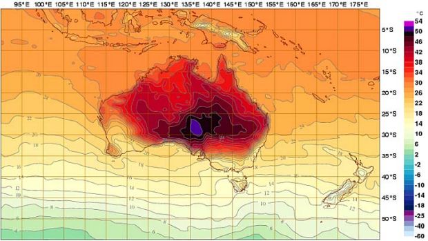
Main image: A 2012 forecast map of temperatures in Australia, where the Bureau of Meteorology added a new purple color to show possible temperatures up to 54°C (129°F). Credit: Bureau of Meteorology
Subscribe to our newsletter
Stay up to date with DeSmog news and alerts


