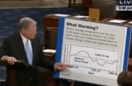
On January 21, Senator James Inhofe (R-OK) again displayed the same deception/incompetence that pervaded his book, The Greatest Hoax (2012).
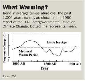
In this video segment (3:00-5:20), he presented a poster on the Senate floor that matches the image below from “Kyoto by Degrees,” an anonymous Wall Street Journal (WSJ) Opinion piece, June 21, 2005. Both contained claims plausibly called academic or journalistic deception (or even fraud), created for public confusion.
Regardless of ancient temperatures, modern temperature rise is human-caused, not just natural variation: you damaged your furnace so it now ignores the thermostat. Heat varies erratically, room by room, and day by day, but each week the house is overall wamer than the last. Your attic Arctic fridge’s ice cubes are melting and even the basement freezer is starting to struggle. The furnace will take months to fix, and you need to start, whether or not you believe rumors that some previous owner experienced warmer weather.
MWP‘s ambiguity causes confusion, so will be qualified, as Lamb MWP, BigMWP and ScienceMWP, explained below.
Following is the WSJ image Inhofe used without mentioning that source:
“
The original curve was sketched in 1965 by Hubert Lamb, who grafted estimates of 900-1680AD with 1680-1961AD measurements compiled by Gordon Manley. It covered a 21×34-mile patch of England, no more, and most is an estimate, not a reconstruction. Call that Lamb MWP, honest scientific effort, although estimates at left are known to be high.
It is false to imply this curve to be global or even a reconstruction, as deniers have been doing since 1991. Call that over-claim BigMWP.
“exactly as shown”: Falsification. false citation. Real science uses captions and caveats, ignored here by cherry-pickers who plucked the graph out of context and even altered the image.
“mean”: Fabrication to explain an unprovenanced image.
Someone just made it up. The IPCC wrote: ”The dotted line “nominally represents” the start of the 20th century.”
Lamb MWP curve never global, real science improves
The attached 4-page excerpt from IPCC(1990) includes the real p.202 image in context, shown below for easy comparison with this altered version. Someone changed “Years before present” (sic) to “Year,” deleted (c), capitalized all words and converted sans-serif to serif font.
The resulting image was copied along murky paths, including onto p.33 of Inhofe’s Greatest Hoax book, which cited it as “Intergovernmental Panel on Climate Change, Climate Change, the IPCC Scientific Assessment 202 (1990). His story is clearly refuted by IPCC‘s surrounding text pp.199-203.
The real image was clearly captioned a schematic, i.e., a sketch. The 1990 scientists thought the LIA was global, and but they stated clear reservations about MWP (really BigMWP) as global and synchronous, while certainly accepting warmth in some areas. IPCC(1992) had other curves, not this.
By 1993 real reconstructions, as by Bradley and Jones, were being published, reservations about BigMWP had evolved into strong doubt, and leading experts explicitly disavowed the graph as anything broadly representative.
Jones, et al(2009) Appendix A, p.36 gave the long history behind Fig.7.1(c), and their p.34 Figure at left is instructive. The blue line was an up-to-date Central England measured series. Lamb(1965, 1982) used rainfall and botanical information to estimate everything earlier (red), including all of the putative MWP. ”The amount of extra warmth added during 1100–1350 was 0.3–0.4°C, or about 30% of the range in the black curve in Figure 7. At no place in any of the Lamb publications is there any discussion of an explicit calibration against instrumental data, just Lamb’s qualitative judgement and interpretation of what he refers to as the ‘evidence’. Many in the palaeoclimatic community have known that the IPCC (1990) graph was not representative …”
IPCC(1995) Fig.3.20, p.175 at left combined a much better Bradley and Jones(1993) reconstruction with modern measurements (thicker line at right, up to 1970-79). although in black-and-white image one needs to look closely. It is good science to put both on a graph, clearly labeled, to compare overlaps, and it is done often. Color helps.
Inhofe(2012) p.32-33 fiercely denigrated Mann for integrating reconstruction and measurement, while using a schematic that did the same thing, but with far less accuracy and no visual distinction. Lamb was clear in his texts, but obviously many people never read them. Even if his MWP estimates had been accurate, it is already now warmer in England, not that it actually matters in the slightest to human causes of modern temperature rise.
.
.
.
.
Normal real science kept creating better approximations to reality, by pushing earlier and improving methods. Reconstructing the past greatly helps scientists better understand climate processes and improve models, as per IPCC(1990), p.xxv. It helps bound climate sensitivity and improves insight into important regional variations. Regardless of 1000AD‘s temperatures, the human cause of modern warming is a fact, as per Stefan Rahmstorf or Gavin Schmidt. See also Skeptical Science list of commonly-repeated false memes, #2 (Climate’s changed before), #18 (The hockey stick is broken), #56 (Medieval Warm Period was warmer). Actually, humans may well have been altering climate for thousands of years, as per Bill Ruddiman (2012 AGU lecture), but we are certainly doing it much faster now.
Starting with Jones, Briffa, Barnett and Tett(1998) at left below, and Mann, Bradley and Hughes(1999), at right, credible reconstructions of hemispheric or global temperatures found modest warmth during medieval times, cooler temperatures during the LIA period, but not globally synchronous. Call either ScienceMWP, good approximationx, since improved. Both were used in IPCC(2001) Fig 2.21. Had Mann et al(1999) never been written, IPCC surely would have used Jones et al(1998) and added modern measured temperatures, just as was done with IPCC(1995) above. The resulting hockey stick would surely have drawn the same anti-science fury in defense of their BigMWP narrative.
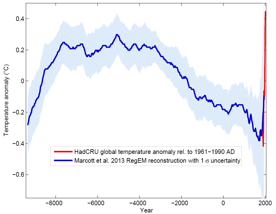
One of the most recent and largest reconstruction efforts is PAGES2K, summarized in 2013 article by Stefan Rahmstorf. His first, unnumbered chart compares it (Green) to the hockey stick (Blue), with HadCRUT4 global mean 1850- (red).
His Figure 2 gives regional reconstructions, of which the authors say, quite clearly:
“There were no globally synchronous multi-decadal hot or cold intervals that define a worldwide Medieval Warm Period or Little Ice Age.”
.
.
.
Rahmstorf went on in Paleocli
“Global temperature, therefore, has risen from near the coldest to the warmest levels of the Holocene within the past century, reversing the long-term cooling trend that began ~5000 yr B.P.”
.
.
.
.
The continuously-updated PAGES2K project is a good source for recent research. Over 3 decades, researchers have improved methods, incorporated more proxies, expanded geographic coverage, drove reconstructions earlier, reduced uncertainties.
Science progresses by generating better approximations to reality. Anti-science does not, just keeps repeating a long-obsoleted 1965 graph, caveated in 1990 and totally rejected by 1993. Some may have been merely incompetent, but others were clearly deceptive.
False narratives to be exposed in detail
Over the same decades, climate deniers promoted a false narrative, often based around variants of Lamb(1965) graph, 3 decades years after IPCC(1990) or ~55 years after Lamb(1965), or as William Connolley calls it, Adoration of the Lamb.
This post starts a series (hashtag #MedievalDeception) to expose the decades of BigMWP abuse of Lamb MWP, apparently originating as shown in MedievalDeception 1991: Lindzen Hijacks Curve For Western Fuels Video – Early Fake News, repeated in Fred Singer’s Hot Talk, Cold Science-Revised Second Edition(1999).
That was followed by John Daly (2001), Steven McIntyre and Ross McKitrick (2005, at least 3 times), Edward Wegman and Yasmin Said (2006), Fred Singer and Dennis Avery (2007), Andrew Montford (2010), Inhofe(2012) and many others.
Even as they usually got the curve correct, the not-quite-right images are almost certainly false citations or misrepresentations, depending on the claims. Either they had no IPCC(1990) to copy, or they did and altered it, but ignored and thus misrepresented the surrounding text. For some, cherry-picking text or graphs seems a way of life, but it is not science.
John Daly(2001) even cited the same image as WSJ, but as IPCC(1995). So did McIntyre and McKitrick(2005, 3 times), showing none had either IPCC report. The latter’s false 1995 date helped make a never-supported tale by David Deming(2005) slightly less silly, later involving Inhofe. Fred Singer and Dennis Avery(2007) invented a nonexistent IPCC(1995) Fig 22, copied but unattributed in books by Ralph B. Alexander(2009) and Steve Goreham(2010, 2013). This process illustrates the intellectual bankruptcy of pseudoskeptics who eagerly seek and repeat unchecked falsehoods that confirm their views. That brings us back to Inhofe’s talk for a few more examples of such behavior.
More examples from Inhofe Senate Video
03:20 Discusses hockey-stick, says “what they forgot was to put these two things (MWP and LIA) in the hockey stick, supposed to be level.” False. The hockey stick in Mann, Bradley and Hughes(1999) has a sloping regression line from warmer around 1000AD to cooler during LIA. It is not and never has been level, despite the false horizontal line on the cover of The Hockey Stick Illusion. There is good evidence for a warm MWP in a few areas, especially around the North Atlantic, a small fraction of Earth. Credible ScienceMWP reconstructions of large areas usually show modest warming during Medieval period, unlike the Lamb MWP. Conspiracy theorists not only cling to BigMWP, but decry any scientific progress as a plot to hide the truth. Anyone who actually studies IPCC(1990, 1992, 1995, 2001, 2007, 2013) knows better.
03:33 “Medieval Warming Period between 1000 and 1500. … left off the charts.” False. The hockey stick covered the Northern Hemisphere, rather more than Lamb’s 1965 estimations for the rectangle below. Larger areas vary less quickly, because some local temperature changes are caused by ocean oscillations that just move heat around, warming and cooling different areas.
04:00 “This actually is IPCC‘s chart. …” False. This was WSJ‘s chart, they certainly did not scan it from IPCC(1990), and it likely passed through someone who couldn’t recall where he got it, as will be seen later in this series. Inhofe made this long-obsolete, dubiously-provenanced graph the centerpiece of his Senate talk.
04:05 “They’re (IPCC) the ones who dreamed up this whole idea.” False. Lamb considered the MWP issue decades earlier. I think Lamb(1965) was heroic work, and I own a copy of Lamb(1982), but I’d guess few deniers have studied either. Inhofe and many others have seriously misrepresented the work of this fine scientist, who was quite clear his curve described a small area of England. He may have thought the MWP to be more widespread, but was careful to report counter-examples to a global synchronous MWP and explain how much was then unknown. Perhaps BigMWP may be an accident of England’s N. Atlantic location and leading early role in climate research.
Area for Central England Temperature series, the longest measured series in the world, but no earlier than 1659 at best. Gordon Manley updated this series for years.
Improved reconstruction of the world’s temperature is a great scientific detective story. It is hard work by thousands.
It is much easier to invent deceptive stories.
The BigMWP story is a flat-Earth map, but some cling to it, without ever reading IPCC(1990) pp.199-203. Some actually cite p.202, but perhaps they copied the citation without reading it.
Even with acknowledged Medieval warmth around the North Atlantic, Vikings in Greenland and grapes in England (but not as far North as today), this rectangle is not the world or even the Northern Hemisphere, no matter what some Senators think. Why would Senator Inhofe spend so much time on this deception? Why does he promote an ill-informed anonymous WSJ Opinion as though it were science? Why might he not want your furnace back in control, using less fuel?
Perhaps a hint is found at OpenSecrets’ James Inhofe Career Funding:
(If browser has trouble with images, see PDF of this post.)
Update 10/04/15: fix some formatting, minor edits, some more text from Jones et al(2009), IPCC SAR Fig 3.20.
Update 10/12/15: add Lamb MWP, BigMWP and ScienceMWP to help disambiguate.
Update 06/30/16: Old Jones et al(2009) linked to file that has been removed, replaced by links to journal and annotated copy of p.36. Fix a few typos.
Update 07/06/16: replaced broken link to Lamb(1965), and added image of Fig 3, fixed typos.
Update 07/29/17: reword to provide link to Medieval Deception 1991.
Update 10/27/19: add PAGES2K charts.
Update 03/16/20: fix broken PAGES2K, other links, use Wayback archived versions where URLs changed, use open-access copies of paywalled articles.
Attached Documents
Subscribe to our newsletter
Stay up to date with DeSmog news and alerts


